Control charts are useful tools. There’s no doubt about it. They’ve been used for decades by operators and engineers to better understand their processes and know when it is time to adjust them. But as long as appropriate statistical rules are in place and those rules are being monitored by an ever-watching computer, do operators really need to see control charts at all times? I would argue that they just need to be alerted to exceptions, so they can stay focused on their jobs.
Control charts are “action charts” that help an operator answer the critical question, “Should I adjust my process, or should I leave it?” I’m convinced that putting control charts in front of operators at all times is unnecessary, and this blog will help me explain why.
Control Charts and SPC
Statistical process control (SPC) is all about the data you collect. In SPC, there are rules in place that state if a data point falls a certain distance from your mean (or its fellow data points)—what we’re calling an exception—then something probably happened during your process, something unexpected. And if your process starts exhibiting a trend, then you need to pay attention.
Control charts were created to provide a visual representation of trends and abnormal patterns, to let you, the operator, know when something has changed from whatever you would normally expect.
They were designed to be easy to plot on paper. Measurements are taken, a mean and standard deviation are calculated, and those two statistics are then plotted as points on charts. As you look at the charts, you must ask yourself a few questions, for example:
- “Did the plot points in question fall too far away from the expected mean?”
If yes, then something definitely happened, and some sort of action should be taken on the process. - “Did two out of three of the last points fall between two and three standard deviations from the expected mean?”
If yes, then (again) action should be taken on the process. - There are many more, but you get the idea.

Paper and Pencil
Using control charts is reading a story of your process…where you’ve been, where things are trending, where things might be going. As an operator, you make necessary adjustments along the way. There are probably many reasons why people love, and sometimes refuse to let go of, control charts—but, more than likely, I think it’s because they tell a story. Pull the big cushy chair up to the hearth, gather round folks, we’re going to tell a story. And it looks to be a good one.
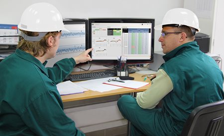
While we love good stories, we also love what we’re used to. Nobody likes change. And control charts are no different. When control charts were on paper (control charts on paper were all manufacturers had for a long time; they served their purpose; and the info derived from them was valuable), it was easy to pin them to the wall, take notes in the margins, etc. However, manual control charts mean calculating means and standard deviations, which can get tedious and be error prone. I think most operators liked the transition to using computers for control charts because the nuisance of calculations and manually plotting went away. However, we kept the traditions of printing out our control charts and pinning them to the wall. Maybe we stopped printing and displayed them on a monitor.

While we embraced the technology to generate control charts, we held onto the tradition of constantly looking at control charts. That made sense when our software was installed on local computers and used a file-based system that wasn’t shared across the site. The printed paper became the rallying point, or the monitor used for display.
But what about now, when we have cloud-based systems that not only allow me to share my control charts across the site, but across all of my sites? Should I be printing out control charts anymore? Do I really need to look at that monitor? Let me ask a different question: There was a time when printing emails was convenient, but now that I can look at my email on my computer, tablet, and smart phone, do I need to print it out? It’s much easier to look at my email whenever I like. I’m here to tell you that the same is true for your control charts.
Not Always the Best Solution
Still not convinced? Here are the two biggest challenges you face when you rely on users to analyze control charts:
- Wrong decision. Having to review too many charts is frustrating and a crazy waste of time. What happens if you don’t pick up that trend? You might skip over a control chart that needs attention because you’re trying to slog your way through a slew of them. We hear this a lot from companies because after switching to computers it’s all too easy to create MANY control charts.
- Trying to help can make the process worse. We all want to fix things (especially Dads—I get it, believe me). For example, your shift just took over and you spot five ascending dots in a row (SPC rule reminder: you’ve set the rule that six in a row ascending/descending means there’s an issue, and you should intervene); so, you want to fix it. That’s tampering with the process. And tampering makes your variation worse.
(I know, it sounds harsh; but that’s what it’s really called—you’re not supposed to touch anything until you hit that magic number “6.”)
Here’s why I point out the “negatives” of control charts: as an operator, is it really your job to be an SPC chart interpretation expert? Or, is it your job to run the equipment and make product?

Moving On…
In the past, operators were asked to look at control charts because that was the only way they could get their immediate “Yes/No,” which—as we’ve already discussed—was absolutely necessary. You always needed to answer that pesky question: “Do I do something or not?”
If you are the person responsible for making an adjustment to a machine when something goes bad, when something is out of control, then you need that story—you need that control chart.
Here at InfinityQS, we’re not saying we should take control charts out of people’s hands; we do not want to lose the benefits of that time-honored tool. Instead, we’re saying, “You don’t need to worry about control charts…until you need to worry about them.” We are here to offer you something different…a new way.
Quality Intelligence to the Rescue
Before we dive into quality intelligence, let’s think about what we’ve talked about so far: operators look at control charts to see when/if something is trending in the wrong direction, and answer that magical “Yes/No” question about whether or not they need to do anything about it.

Because that is the main reason for using control charts, we know that we can help you put them away. InfinityQS Quality Intelligence solutions monitor your data streams using your control chart rules—but in the background, so you can focus on the myriad other tasks you’ve been assigned and stop worrying about control charts every few minutes (like we know many of you do).
Quality Intelligence is the information that is gained when raw data values are converted into information. InfinityQS software products are designed to do just that: Convert data into actionable information. Using our software, you can review any quality data and uncover information about every step in your manufacturing operations.
Our Quality Intelligence solutions can help you in many ways:
- Alert you when you need to do something; when the answer is “Yes.”
When you receive that notification that informs you that some statistical rule has been violated, then you can turn your attention to the story (control chart) and determine what action you need to take. The notification includes a link to the control chart, so you can get there immediately. - Prioritize your control charts. When you have a stack of charts to review, you want to start with only those with violations and, when time permits, turn your attention to the others.
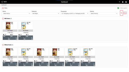
- Find your control charts. If in your industry you take dozens of measurements on each part, it is very helpful to find just the right chart when you need it, for example:
- All of the control charts for OD – Loc A that have statistical violations
or - All of the control charts from Lathe 167 for Part 123 and Part 124 for OD – Loc A, OD – Loc B and OC – Loc C
- All of the control charts for OD – Loc A that have statistical violations
This allows you to browse your data and look for improvement opportunities more proactively than waiting for statistical violations. It’s like being able to shuffle that stack of charts to get the exact charts you want to see.
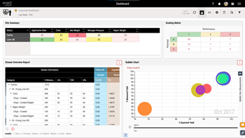
Enact®, the InfinityQS Quality Intelligence platform, features a Stream Summary dashboard tile to help you accomplish these things. Enact gives you all the power of control chart analysis without having to constantly look at chart after doggoned chart.
Charting a Course
We mentioned how control charts tell a “story,” but (as we’ve shown) they aren’t the only way to tell stories. There are other tools that you should consider. Since we have tools that are constantly monitoring the data for this control chart analysis, we can focus our attention on things like exceptions and summaries. There are some great tools for this:
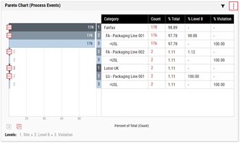
- Process Event Paretos summarize events to allow users to see where problems are happening and “slice and dice” those by different criteria (e.g., site, feature, part, shift, etc.). Questions like, “Which production line is having the most specification limit violations for net weight?” are a snap to answer.
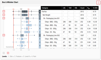
- Box-and-Whisker Charts are another tool that enables comparison of different data in various ways that a control chart just can’t accomplish. Trying to line up and compare many control charts at once is not feasible, but Box-and-Whisker charts are designed to do this kind of analysis.
- Stream Grading is a way in which Enact can really simplify looking at process performance. You can easily zoom from a site level view to an individual data stream view to understand where process improvements can have the most impact on product yield. While control charts are great decision charts, they are for immediate decisions, but that same data is valuable for making bigger, longer-term decisions.
None of these visualizations are designed to replace a control chart, but by using the right tool for the right circumstance you can gain even more insight into your operations. You can now look beyond individual data streams (like on a control chart) and start looking at the bigger patterns and trends of your manufacturing processes.
Closing
Let’s return to the pencil and paper example to finish our thoughts on control charts. Imagine you’re creating control charts by hand. And you’ve been tasked with making 100 of them. Now, imagine you’ve got a new “helper” who says they will find and tell you each time one of those charts has a violation. AND, they’ll divide all those 100 control charts into a pile of charts with violations, sorted so the charts with most violations are at the top of the stack, and a different pile for charts without violations. And they will instantly reshuffle and reorganize all the charts based on whatever criteria you have. Would you welcome that kind of help?
That’s exactly what we offer with our Quality Intelligence platform, Enact. Control charts are, indeed, useful tools, as we mentioned at the top. But operators and engineers need not have their eyes on them all the time. They just need to be alerted to exceptions, so they can stay focused on their jobs and keep pumping out great product.
Take advantage of the technology at your fingertips today: contact one of our account managers (1.800.772.7978 or via our website) for more information.