How Do You Use Group Short Run Xbar-R Charts?
Group short run Xbar and range (Xbar-R) charts can help you evaluate changes in the process average and range of averages across multiple characteristics in a limited production run. Review the following example—an excerpt from Innovative Control Charting1—to get a sense of how a group short run Xbar-R chart works.
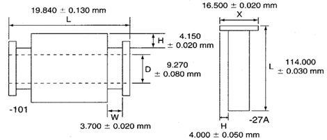
Figure 1. Two parts containing multiple key characteristics.
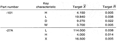
Table 1. Key characteristics with respective target values.
Case Description
A single lathe produces many different part numbers, each with many different key characteristics. The two parts shown in Figure 1 are examples. The manager of the machine shop wants to use only one chart for each lathe to monitor the process regardless of the part numbers or key characteristics being produced.
Bring SPC Charts Up to Speed
This example provides a deep dive into the manual calculations behind the group short run Xbar-R chart. InfinityQS® solutions—ProFicient™ and Enact®—automate chart creation and help you optimize processes faster.
LEARN MORE ABOUT MODERN SPC SOLUTIONS.
Sampling Strategy
The same chart must allow for different part numbers and different key characteristics. Because each characteristic may be unique with respect to its nominal, tolerance, and unit of measure, a group short run Xbar-R chart is selected. This chart will separate variation due to the lathe from variation unique to each part and characteristic.
The cycle time varies, but lot sizes are typically 20 to 100 parts. Cutting tools are replaced about every three hours. The data represent measurements taken every fifteenth part regardless of the part number (n = 3).
Data Collection Sheet
Table 2. Data collection sheet for the group short run Xbar-R chart lathe example. MAX and MIN plot points are shown in bold.
Group Short Run Xbar-R Chart
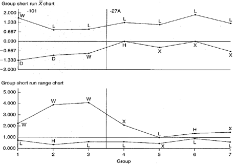
Figure 2. Group short run Xbar-R charts representing two parts and multiple characteristics.
Chart Interpretation
Group short run range chart: During the -101 part run, key characteristic width W appears in the MAX position all three times. There is a possibility of this happening by chance if all four keys are behaving randomly about their target values, but this may be an indicator of significantly greater variability in the W dimension as compared with others.
The L dimension appears in the MIN position five out of seven times. This likely represents a nonrandom pattern indicating less variability in the L dimension across both parts.
Group short run Xbar chart: The L characteristic on both the -101 and -27A appears in the MAX position six out of seven times. The chance of this occurring randomly is very small. This is most likely a nonrandom pattern that is related to the process itself. That is, regardless of the part number, the process tends to cut lengths on the high side.
During the manufacture of the -27A part, the rim of three plot points in the MIN position for dimension X may indicate the presence of a nonrandom pattern.
Recommendations
- Operators and process engineers should try to identify why the lathe tends to cut all part lengths on the high side and why the W dimension on the -101 part displays more relative variation than the other three key characteristics. In addition, operators and engineers should try to isolate the reason why the L dimension varies less than other dimensions.
- Watch the X dimension on the -27A part and subsequent part numbers. If the dimension continues to fall in the MIN position on the group short run Xbar chart, there should be an investigation for nonrandom patterns that relate to process-specific causes. If, however, the X dimension fails to fall into the MIN position for subsequent part numbers, the cause should be treated as product specific.
Estimating the Process Average
Estimates of the process average are calculated separately for each characteristic for each part on the group short run charts. This is illustrated in Calculation 1 using data from the H dimension on the -27A part.
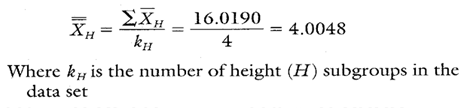
Calculation 1. Estimate of the process average for characteristic H on part -27A.
Estimating Sigma
Estimates of sigma are also calculated separately for each characteristic on each part on the group short run charts. Continuing with characteristic H, sec Calculations 2 and 3.
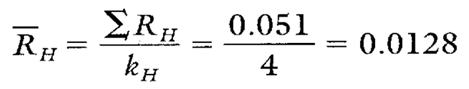
Calculation 2. R calculation for characteristic H on part -27A.
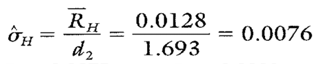
Calculation 3. Estimate of the process standard deviation for characteristic H on part -27A.
Note: To ensure reliable estimates, k needs to be at least 20. In this example, k is only four. Therefore, the estimates shown here and in Table 3 are used only for illustration purposes.
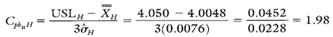
Calculating Process Capability and Performance Ratios
Calculations 4, 5, and 6 show the process capability and performance calculations for characteristic H.

Calculation 4. Cp calculation for characteristic H.
Calculation 5. Cpk upper calculation for characteristic H.
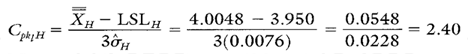
Calculation 6. Cpk lower calculation for characteristic H.
Group Short Run Xbar-R Chart Advantages
- Graphically illustrates the variation of multiple product or process characteristics on the same chart.
- Characteristics from different parts with different means, different standard deviations, and different units of measure can be analyzed all on the same chart.
- Separates variation due to changes in the average from variation due to changes in the standard deviation.
- Separates variation due to the process from variation specific to a product characteristic.
Group Short Run Xbar-R Chart Disadvantages
- No visibility of characteristics that fall between the MAX and MIN plot points.
- Cannot detect certain out-of-control conditions because the group charts described here have no control limits.
- Many calculations are required to code the data.
Additional Comments About the Case
- Additional statistics and process capability and performance calculations for part characteristic L and X for part -27A are shown in Table 3.
- Notice that characteristic L, while not capable, has a negative Cpku L value. This indicates that XL falls outside of the upper specification limit. In fact, the average falls more than 0.020 mm outside of the USL of 114.03 mm. This underscores the importance of reacting to characteristic L’s nonrandom pattern shown on the group short run Xbar chart in Figure 2.
- Characteristic X has Cp and Cpk values that arc not only greater than one, but very close, numerically to one another. Therefore, characteristic X is capable and its Xx is almost perfectly centered on its engineering nominal value of 16.500 mm.
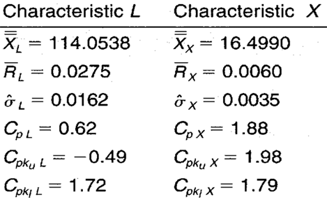
Table 3. Additional statistics and process capability and performance ratios for characteristics L and X from part -27A.
FOOTNOTE: 1 Wise, Stephen A. and Douglas C. Fair. Innovative Control Charting: Practical SPC Solutions for Today’s Manufacturing Environment. Milwaukee, WI: ASQ Quality Press.